Slope is a registered snowboard company of my creation. Its logo is a vector of two mountains at the end of a run. The images on this page explore branding through ad creation, product design and mobile applications.

Above are examples of exterior and interior signage.

On the left are alternative logos for Slope. The compilation of vectors shows the process taken to arrive at the final logo. Triangles are used frequently due to the symbols ties to exploration and change.
On the right is a mockup of Slope stationary and electronic applications of the logo. These designs were created using Adobe Photoshop and InDesign.

Here are different products produced by Slope, including snowboards and apparel. On the left, the decks showcase hand-drawn illustration, vector illustration and photography. The designs chosen are meant to embody the essence of Slope, which is young, hip and edgy.
Featured on the right, are examples of men’s and women’s apparel sporting the Slope logo.

Here are examples of men’s and women’s goggles and the packaging they would come in. The packaging is true to scale and was created using Adobe Illustrator.
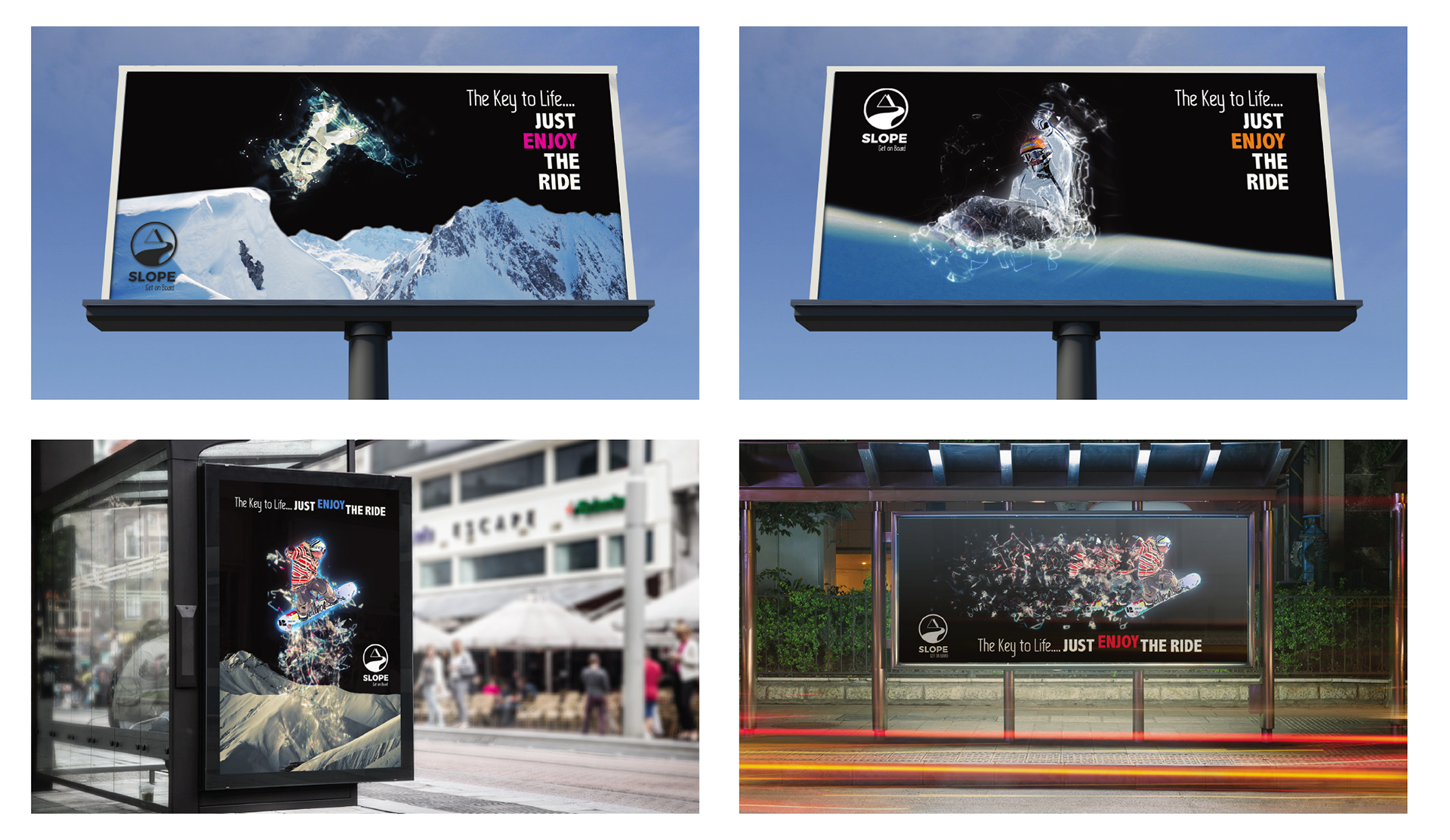
The “Enjoy the Ride” campaign is intended to increase brand awareness. All ads were created using Fractal Actions.
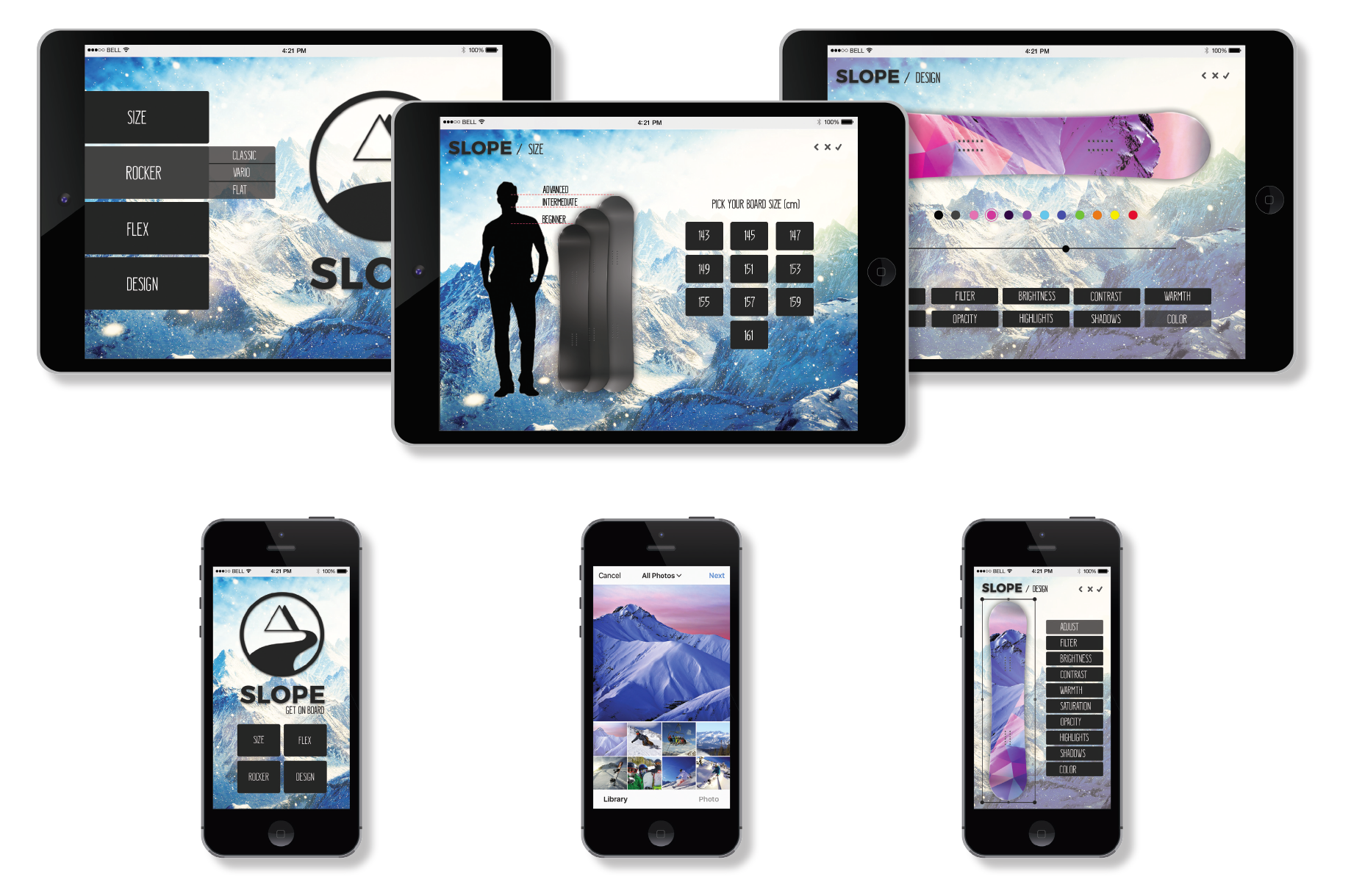
This mobile app allows the user to design their own snowboard. Similar to Instagram, the designer can choose from their own photo gallery and manipulate the image through a number of filters. The app allows for further customization of the board by offering different size, flex and rocker options.
Once the board is created, the user would be able to place an order with Slope to manufacture their custom board. These designs were created using Adobe Photoshop.